Nasdaq Historic Trend Trading Chart - March 2010
Submitted by Van Beek on April 8, 2010 - 12:24
Every month, Stock Trend Investing is publishing one of its historic trend trading charts for free. This month, it is the trend trading chart or the Nasdaq.
The blue line shows the closing price of the Nasdaq index for that month.
The green line signals when our Initial Trend Expectation for the Nasdaq was "Up". The red line signals when our Initial Trend Expectation for the Nasdaq was "Down" or when there was a special warning.
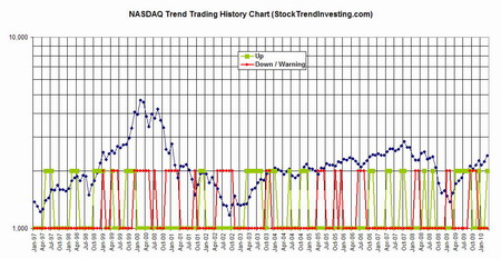
Click and drag the chart to a tab in your browser to see an enlargement.
Just looking at the Nasdaq index, we see an up-wards trend for the coming 3 to 6 months. However, trends for one index always would need to be seen as part of the regional or world wide trend.
Monthly we publish in our Gold Member section of our website the Initial Trend Expectations for all market indices covered and the overall Trend Expectation per region.
To start, sign up for our free e-newsletter and claim a free coy of our latest eBook.

Next & Previous Blog Post
- ‹ previous
- 28 of 174
- next ›